6.7 KiB
Visualization
Visualization supports single model evaluation results and multi-model comparison, as well as visualization of mixed dataset evaluations.
This visualization tool is specifically designed for displaying model evaluation results. It is not intended for visualizing stress test results of model inference services. For visualization of stress test results for model inference services, please refer to the [Stress Test Visualization Guide](../user_guides/stress_test/quick_start.md#visualizing-test-results).
Install Dependencies
Install the dependencies required for visualization, including gradio, plotly, etc.
pip install 'evalscope[app]' -U
Visualization requires `evalscope>=0.10.0` output evaluation reports. If the version is less than `0.10.0`, please upgrade `evalscope` first.
Start Visualization Service
Run the following command to start the visualization service.
evalscope app
The supported command-line arguments are as follows:
--outputs: A string type used to specify the root directory of the evaluation report, with a default value of./outputs.--lang: A string type used to specify the interface language, with a default value ofzh, supportszhanden.--share: A flag indicating whether to share the application, default value isFalse.--server-name: A string type with a default value of0.0.0.0, used to specify the server name.--server-port: An integer type with a default value of7860, used to specify the server port.--debug: A flag indicating whether to debug the application, default value isFalse.
You can access the visualization service in the browser if the following output appears.
* Running on local URL:  http://127.0.0.1:7860

To create a public link, set `share=True` in `launch()`.
Quick Start
Run the following commands to download the sample and quickly experience the visualization feature. The sample includes evaluation results of the Qwen2.5-0.5B and Qwen2.5-7B models on several datasets for some examples.
git clone https://github.com/modelscope/evalscope
evalscope app --outputs evalscope/examples/viz
Features Introduction
Selecting an Evaluation Report
Follow the steps shown below to select an evaluation report:
:alt: alt text
:width: 60%
:align: center
-
Enter the root directory of the evaluation report. The default value is
./outputs. The directory structure to locate the evaluation report JSON files is as follows:outputs/ ├── time_stamp_1 │ ├── reports │ │ ├── model_name_1 │ │ │ ├── report1.json │ │ │ ├── report2.json ├── time_stamp_2 │ ├── reports │ │ ├── model_name_1 │ │ │ ├── report1.json │ │ │ ├── report2.json -
Select an evaluation report by clicking the dropdown menu. If not selected, a warning will pop up.
-
Click the
Load and Viewbutton to view the visualization.
Single Model Evaluation Result Visualization
- Click the
Single Modeltab button. - Choose the loaded evaluation report in the
Select Reportdropdown menu to automatically display the overview of the evaluation report. - Click
Task Configto view task configuration details.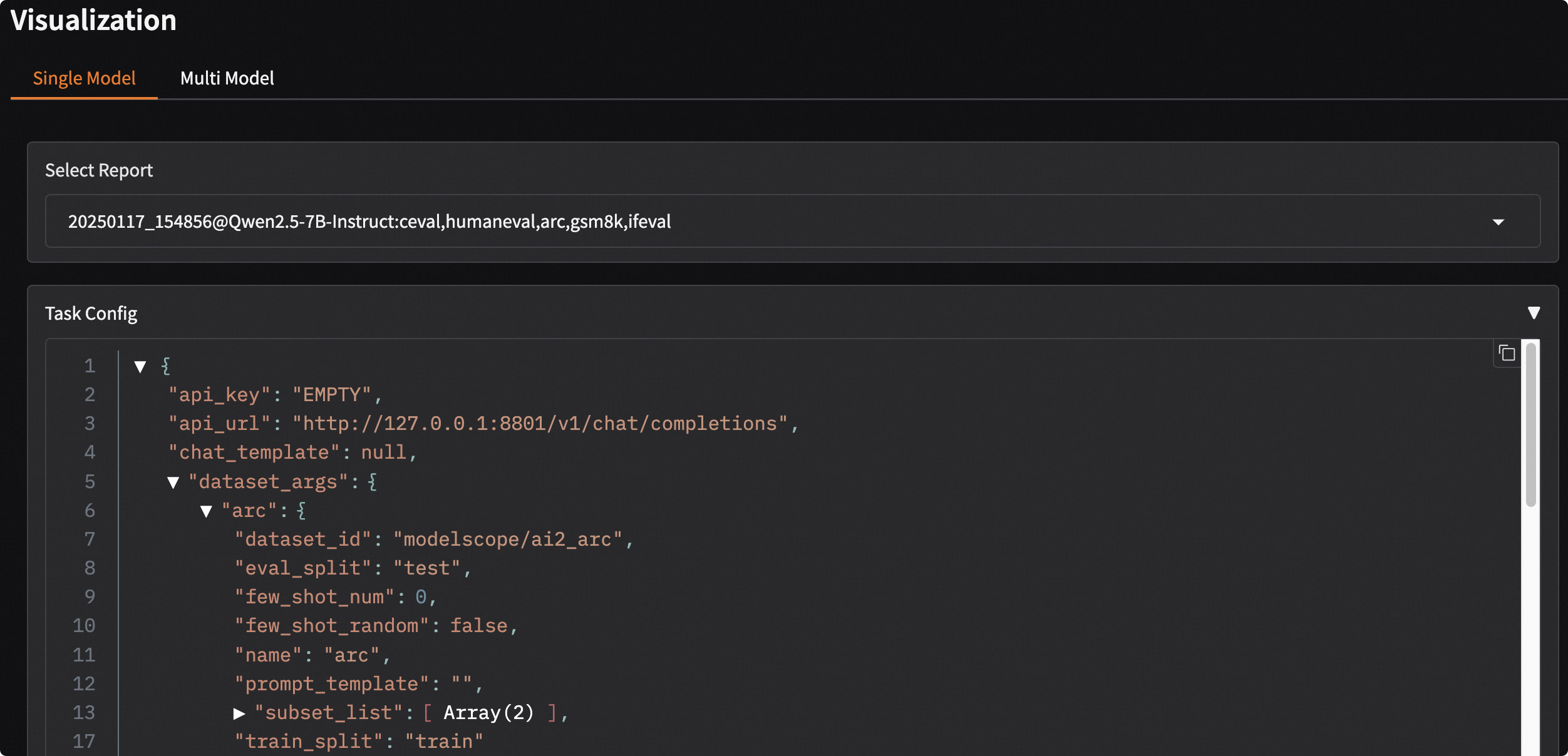
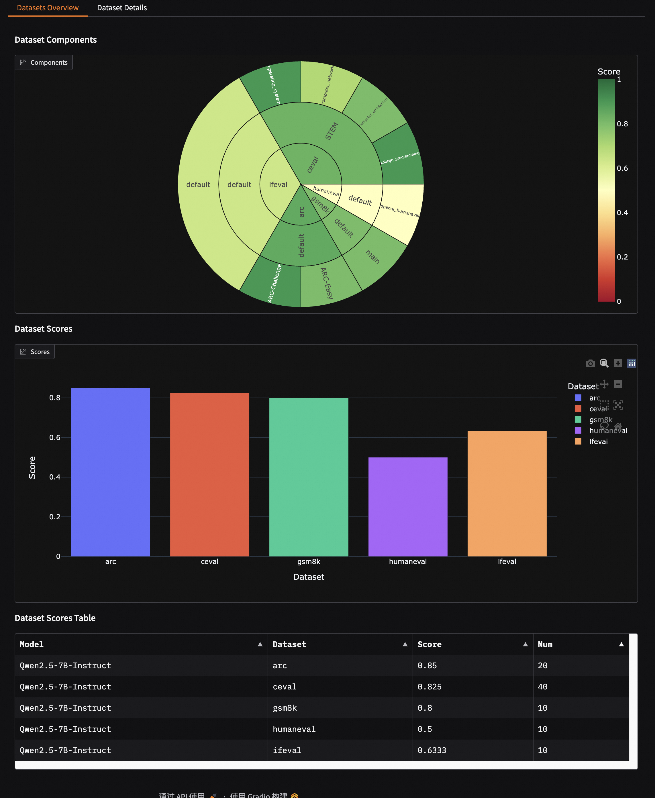
Evaluation Report Overview
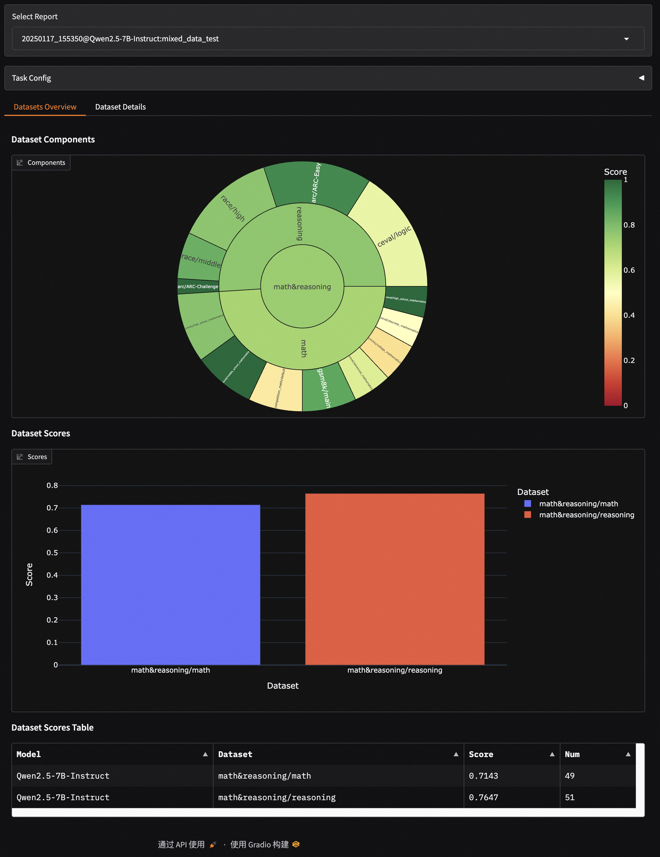
- Displays the composition of the evaluation datasets: from inside to outside, it represents dataset name, dataset category, and sub-dataset name; the size of the sector indicates the number of samples in the dataset; the color represents the dataset score.
- Scores of each dataset are shown using bar charts and tables.
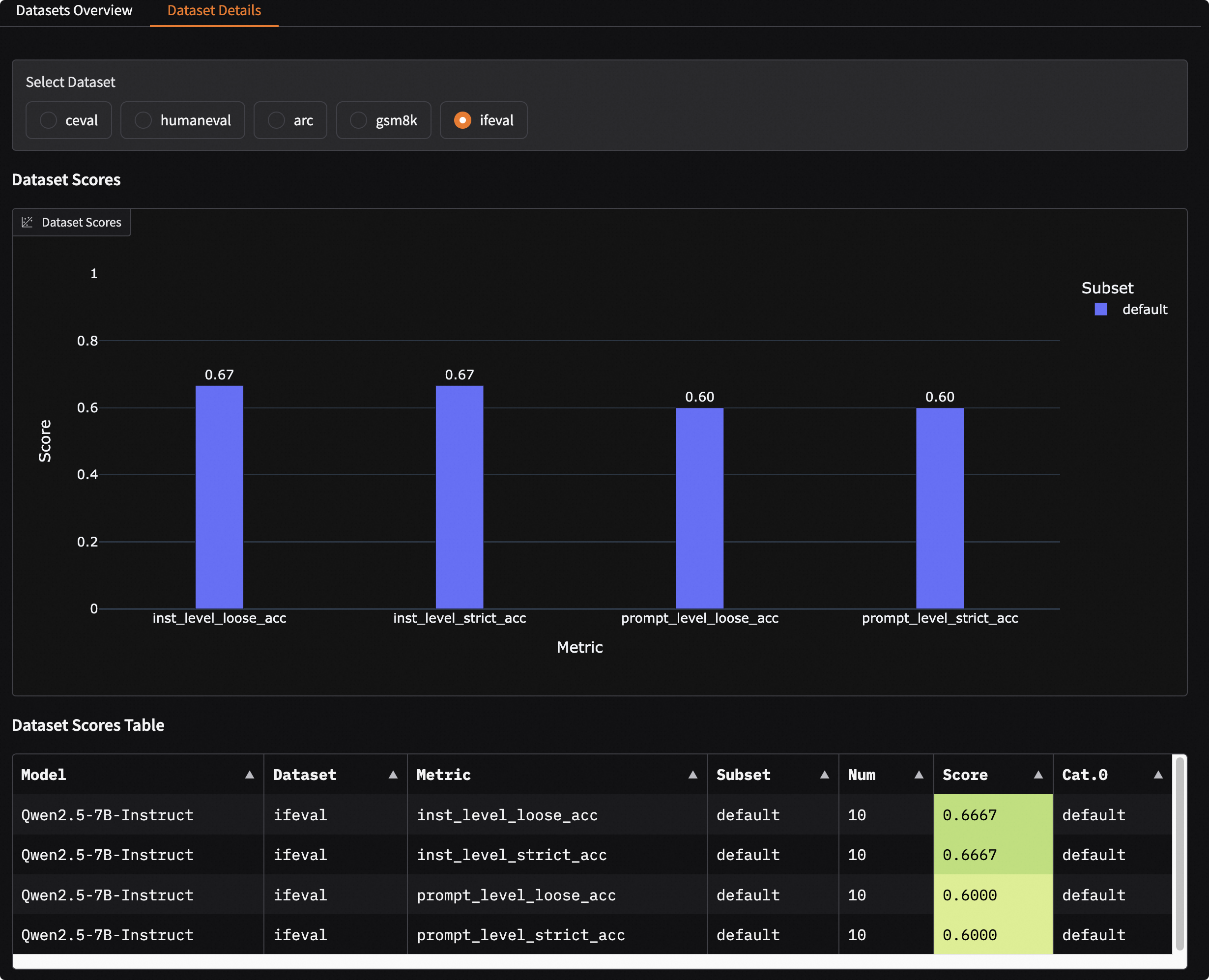
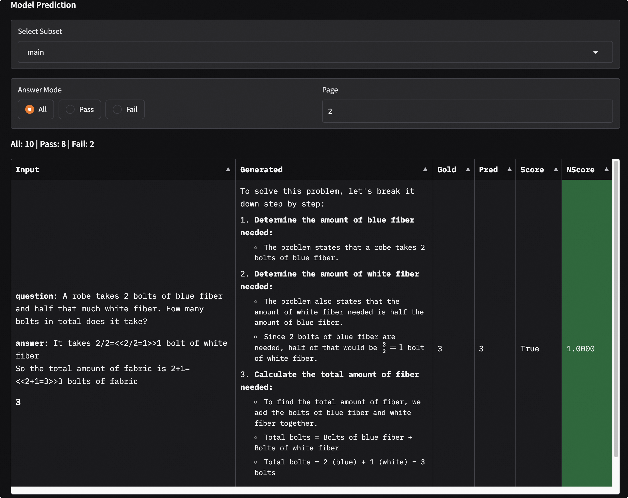
Details of a Single Dataset
-
Select a dataset to display the model's evaluation results on that dataset.
-
Use bar charts and tables to display the model's evaluation results on different metrics and sub-datasets.
-
Choose a sub-dataset to display the model's evaluation results on that sub-dataset. You can filter the model output results by clicking
Answer Mode. Among them:Inputdenotes the model input;Generateddenotes the model output;Golddenotes the standard answer;Preddenotes the post-processed model prediction result;Scoredenotes the model score;NScoredenotes the normalized model score, indicating whether the model score passed.
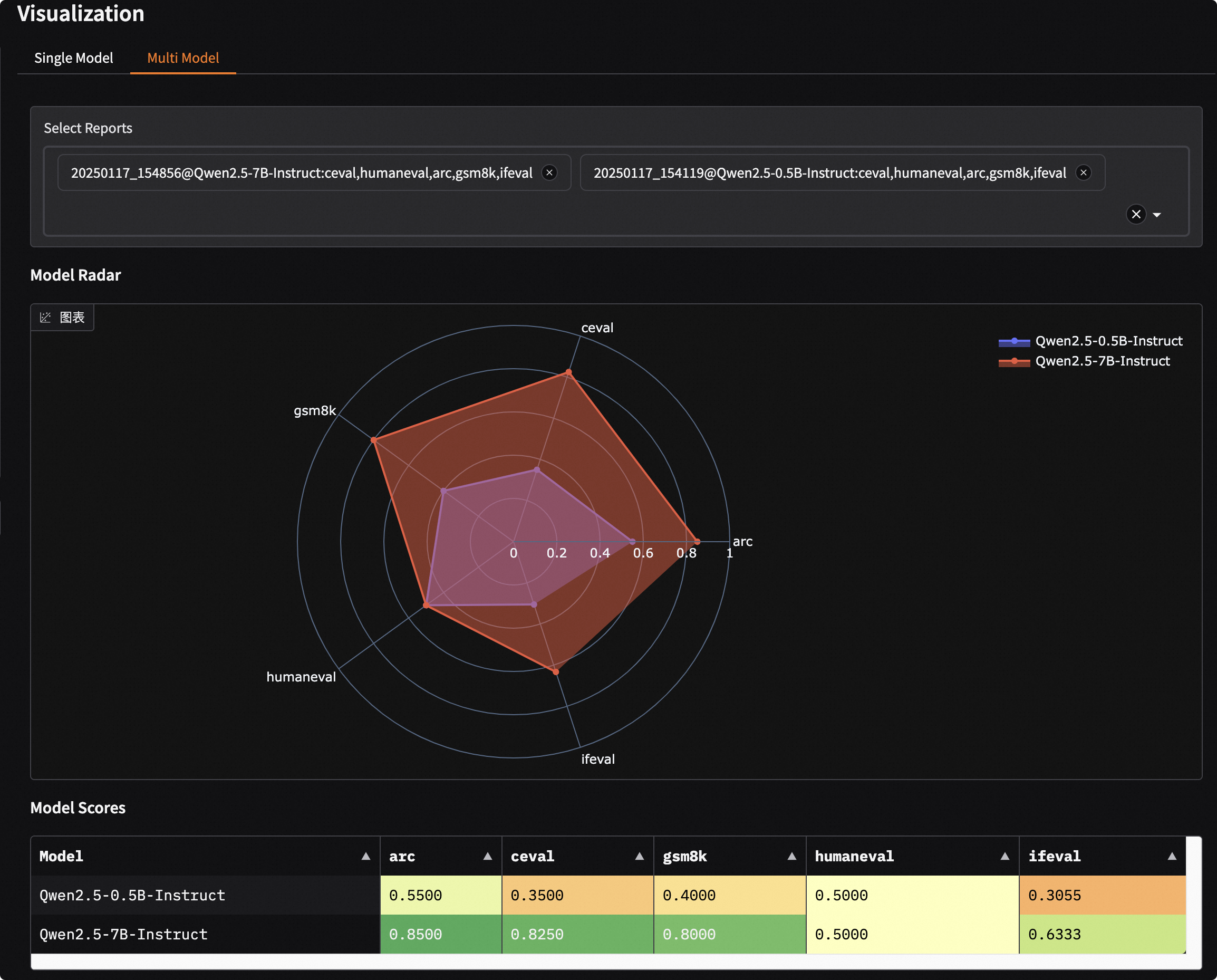
Comparative Visualization of Multi-Model Evaluation Results
- Click the
Multi-Modeltab button. - Choose the loaded evaluation reports in the
Select Reportdropdown menu to automatically display the overview of the evaluation reports. Multiple selections are possible. - Display using radar charts and comparative tables.
Mixed Dataset Evaluation Visualization
This dashboard also supports visualization for mixed dataset evaluation, which will be displayed according to the structure of the data mix schema.
For example, the schema with the following structure:
schema = CollectionSchema(name='math&reasoning', datasets=[
            CollectionSchema(name='math', datasets=[
               DatasetInfo(name='gsm8k', weight=1, task_type='math', tags=['en', 'math']),
               DatasetInfo(name='competition_math', weight=1, task_type='math', tags=['en', 'math']),
               DatasetInfo(name='cmmlu', weight=2, task_type='math', tags=['zh', 'math'], args={'subset_list': ['college_mathematics', 'high_school_mathematics']}),
               DatasetInfo(name='ceval', weight=3, task_type='math', tags=['zh', 'math'], args={'subset_list': ['advanced_mathematics', 'high_school_mathematics', 'discrete_mathematics', 'middle_school_mathematics']}),
            ]),
            CollectionSchema(name='reasoning', datasets=[
               DatasetInfo(name='arc', weight=1, task_type='reasoning', tags=['en', 'reasoning']),
               DatasetInfo(name='ceval', weight=1, task_type='reasoning', tags=['zh', 'reasoning'], args={'subset_list': ['logic']}),
               DatasetInfo(name='race', weight=1, task_type='reasoning', tags=['en', 'reasoning']),
            ]),
         ])
The visualization report is as follows, where the structure is consistent with the schema:
math&reasoning
├── math
│   ├── gsm8k
│   ├── competition_math
│   ├── cmmlu
│   ├── ceval
├── reasoning
│   ├── arc
│   ├── ceval
│   ├── race